ArkTS数据可视化:Canvas 2D 绘图与图表
一、引言
数据可视化是将抽象数据转化为直观图形的重要技术。无论是柱状图、折线图、饼图,还是自定义的仪表盘、地图,都能帮助用户快速理解数据背后的信息。HarmonyOS 提供了强大的 Canvas 绘图能力,通过 CanvasRenderingContext2D 可以在画布上绘制各种图形。
本文将以一个白底彩色图表风格的数据可视化页面为主线,深入讲解 Canvas 绘图的核心 API,并通过一个完整的柱状图案例帮助读者掌握数据可视化的开发技能。
二、Canvas 基础
2.1 什么是 Canvas
Canvas 是 ArkUI 的画布组件,提供了一个矩形绘图区域。通过 CanvasRenderingContext2D 上下文对象,可以绘制:
- 基本图形(矩形、圆形、线条)。
- 文本。
- 渐变填充。
- 图像。
- 复杂图表。
2.2 创建画布
// 创建渲染上下文设置
private settings: RenderingContextSettings = new RenderingContextSettings(true);
// 创建 2D 渲染上下文
private context: CanvasRenderingContext2D = new CanvasRenderingContext2D(this.settings);

build() {
  Canvas(this.context)
    .width(340)
    .height(240)
    .backgroundColor('#FFFFFF')
}
代码说明:
RenderingContextSettings(true):渲染上下文设置,参数true表示开启抗锯齿,让图形边缘更平滑。CanvasRenderingContext2D(settings):创建 2D 渲染上下文。Canvas(this.context):Canvas 组件绑定渲染上下文。
三、Canvas 核心 API
3.1 绘制矩形
// 填充矩形
ctx.fillStyle = '#FF6B81';
ctx.fillRect(x, y, width, height);

// 描边矩形
ctx.strokeStyle = '#FF6B81';
ctx.strokeRect(x, y, width, height);

// 清除区域
ctx.clearRect(x, y, width, height);
3.2 绘制圆形
// 开始路径
ctx.beginPath();
// 绘制圆弧(圆)
ctx.arc(cx, cy, radius, 0, Math.PI * 2);
// 填充
ctx.fill();
// 或描边
ctx.stroke();
3.3 绘制线条
// 开始路径
ctx.beginPath();
// 移动到起点
ctx.moveTo(x1, y1);
// 画线到终点
ctx.lineTo(x2, y2);
// 设置颜色和宽度
ctx.strokeStyle = '#EEEEEE';
ctx.lineWidth = 1;
// 描边
ctx.stroke();
3.4 绘制文本
// 设置字体
ctx.font = '10px sans-serif';
// 设置对齐方式
ctx.textAlign = 'center';
// 设置颜色
ctx.fillStyle = '#2F3542';
// 绘制文本
ctx.fillText('文本内容', x, y);
3.5 渐变填充
// 创建线性渐变
const grad = ctx.createLinearGradient(x1, y1, x2, y2);
// 添加颜色节点
grad.addColorStop(0, '#FF6B81');
grad.addColorStop(1, '#FFA502');
// 设置填充样式
ctx.fillStyle = grad;
// 填充
ctx.fillRect(x, y, width, height);
四、实战代码:柱状图绘制
下面我们实现一个完整的柱状图数据可视化页面。
4.1 定义数据结构
interface DataRow {
  label: string;
  value: number;
}
代码说明:
DataRow 接口描述图表数据:
label:数据标签(月份)。value:数据数值。
4.2 组件定义
@Entry
@Component
struct CanvasPage {
  private settings: RenderingContextSettings = new RenderingContextSettings(true);
  private context: CanvasRenderingContext2D = new CanvasRenderingContext2D(this.settings);
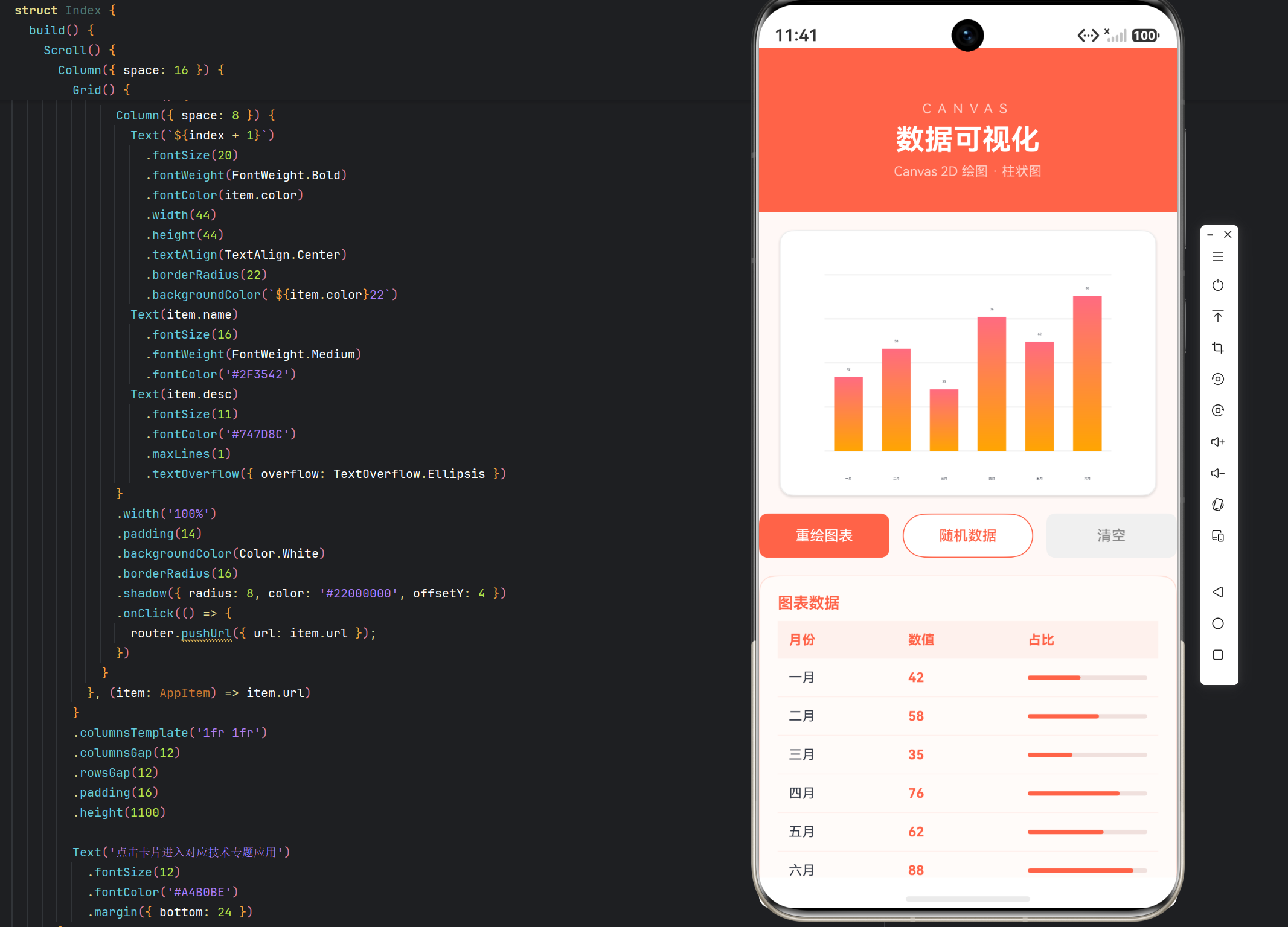
  @State data: DataRow[] = [
    { label: '一月', value: 42 },
    { label: '二月', value: 58 },
    { label: '三月', value: 35 },
    { label: '四月', value: 76 },
    { label: '五月', value: 62 },
    { label: '六月', value: 88 }
  ];
  @State canvasWidth: number = 340;
  @State canvasHeight: number = 240;
代码说明:
settings和context是私有成员,创建画布上下文。@State data:图表数据,6 个月的数值。@State canvasWidth/canvasHeight:画布尺寸。
4.3 绘制柱状图
drawChart(): void {
  const ctx = this.context;
  ctx.clearRect(0, 0, this.canvasWidth, this.canvasHeight);
  const padding = 40;
  const chartW = this.canvasWidth - padding * 2;
  const chartH = this.canvasHeight - padding * 2;
  const maxVal = 100;

  // 背景网格
  ctx.strokeStyle = '#EEEEEE';
  ctx.lineWidth = 1;
  for (let i = 0; i <= 4; i++) {
    const y = padding + (chartH / 4) * i;
    ctx.beginPath();
    ctx.moveTo(padding, y);
    ctx.lineTo(this.canvasWidth - padding, y);
    ctx.stroke();
  }

  // 绘制柱状图
  const barW = chartW / this.data.length * 0.6;
  const gap = chartW / this.data.length;
  this.data.forEach((item: DataRow, i: number) => {
    const h = (item.value / maxVal) * chartH;
    const x = padding + gap * i + (gap - barW) / 2;
    const y = padding + chartH - h;
    const grad = ctx.createLinearGradient(x, y, x, y + h);
    grad.addColorStop(0, '#FF6B81');
    grad.addColorStop(1, '#FFA502');
    ctx.fillStyle = grad;
    ctx.fillRect(x, y, barW, h);
    // 数值标签
    ctx.fillStyle = '#2F3542';
    ctx.font = '10px sans-serif';
    ctx.textAlign = 'center';
    ctx.fillText(`${item.value}`, x + barW / 2, y - 6);
    // 横轴标签
    ctx.fillText(item.label, x + barW / 2, this.canvasHeight - 14);
  });
}
代码说明:
drawChart 方法是柱状图绘制的核心,逐段分析:
-
清空画布:
ctx.clearRect(0, 0, w, h)清空整个画布,为重新绘制做准备。 -
计算绘图区域:
padding = 40:四周留白,为坐标轴和标签留空间。chartW = canvasWidth - padding * 2:绘图区宽度。chartH = canvasHeight - padding * 2:绘图区高度。maxVal = 100:数据最大值,用于归一化高度。
-
绘制背景网格:
- 循环 5 次(i 从 0 到 4),绘制 4 条水平网格线。
- 每条线从
(padding, y)画到(canvasWidth - padding, y)。 - 使用
beginPath→moveTo→lineTo→stroke的标准路径绘制流程。 - 网格线颜色
#EEEEEE浅灰,作为图表背景辅助线。
-
计算柱状图参数:
barW = chartW / data.length * 0.6:柱宽,占每个槽位的 60%。gap = chartW / data.length:每个柱子的槽位宽度。
-
遍历绘制每根柱子:
h = (value / maxVal) * chartH:根据数值计算柱高(归一化)。x = padding + gap * i + (gap - barW) / 2:计算柱子的 x 坐标(居中于槽位)。y = padding + chartH - h:计算柱子的 y 坐标(底部对齐)。
-
渐变填充:
createLinearGradient(x, y, x, y + h)创建从上到下的线性渐变。addColorStop(0, '#FF6B81')顶部粉色。addColorStop(1, '#FFA502')底部橙色。fillRect(x, y, barW, h)绘制渐变填充的柱子。
-
绘制数值标签:
- 在柱子上方
y - 6位置绘制数值。 textAlign = 'center'居中。
- 在柱子上方
-
绘制横轴标签:
- 在画布底部
canvasHeight - 14位置绘制月份标签。
- 在画布底部
4.4 初始化绘制
aboutToAppear(): void {
  setTimeout(() => { this.drawChart(); }, 200);
}
代码说明:
- 在
aboutToAppear中延迟 200ms 调用drawChart。 - 延迟是为了确保 Canvas 组件已完成布局,避免在尺寸未就绪时绘制导致图形错位。
4.5 构建 UI
build() {
  Scroll() {
    Column({ space: 16 }) {
      // 顶部标题
      Column() {
        Text('CANVAS')
          .fontSize(12)
          .fontColor('#FFD0C8')
          .letterSpacing(6)
        Text('数据可视化')
          .fontSize(26)
          .fontWeight(FontWeight.Bold)
          .fontColor(Color.White)
          .margin({ top: 6 })
        Text('Canvas 2D 绘图 · 柱状图')
          .fontSize(12)
          .fontColor('#FFD0C8')
          .margin({ top: 6 })
      }
      .width('100%')
      .padding({ top: 48, bottom: 30 })
      .backgroundColor('#FF6348')

      // 画布
      Canvas(this.context)
        .width(this.canvasWidth)
        .height(this.canvasHeight)
        .backgroundColor('#FFFFFF')
        .borderRadius(12)
        .border({ width: 1, color: '#EEEEEE' })
        .shadow({ radius: 8, color: '#22000000', offsetY: 4 })

      // 工具按钮行
      Row({ space: 12 }) {
        Button('重绘图表')
          .height(40)
          .layoutWeight(1)
          .fontSize(13)
          .fontColor(Color.White)
          .backgroundColor('#FF6348')
          .borderRadius(8)
          .onClick(() => { this.drawChart(); })
        Button('随机数据')
          .height(40)
          .layoutWeight(1)
          .fontSize(13)
          .fontColor('#FF6348')
          .backgroundColor('#FFFFFF')
          .borderRadius(8)
          .border({ width: 1, color: '#FF6348' })
          .onClick(() => {
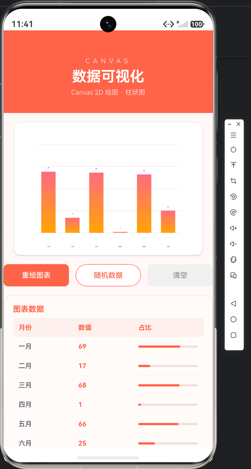
            this.data = this.data.map((d: DataRow) => ({
              label: d.label,
              value: Math.floor(Math.random() * 100)
            }));
            this.drawChart();
          })
        Button('清空')
          .height(40)
          .layoutWeight(1)
          .fontSize(13)
          .fontColor('#888888')
          .backgroundColor('#F0F0F0')
          .borderRadius(8)
          .onClick(() => {
            this.context.clearRect(0, 0, this.canvasWidth, this.canvasHeight);
          })
      }
      .width('100%')
代码说明:
工具按钮行包含三个操作:
- 重绘图表:调用
drawChart()重新绘制。 - 随机数据:使用
map生成新的随机数据,然后重绘。注意这里使用map创建新数组,确保@State数据更新触发刷新。 - 清空:
clearRect清空画布。
      // 数据表格
      Column() {
        Text('图表数据')
          .fontSize(14)
          .fontWeight(FontWeight.Bold)
          .fontColor('#FF6348')
          .alignSelf(ItemAlign.Start)
          .margin({ bottom: 8 })
        Row() {
          Text('月份').layoutWeight(1).fontSize(12).fontWeight(FontWeight.Bold).fontColor('#FF6348')
          Text('数值').layoutWeight(1).fontSize(12).fontWeight(FontWeight.Bold).fontColor('#FF6348')
          Text('占比').layoutWeight(1).fontSize(12).fontWeight(FontWeight.Bold).fontColor('#FF6348')
        }
        .width('100%')
        .padding(10)
        .backgroundColor('#FFF0ED')

        ForEach(this.data, (row: DataRow) => {
          Row() {
            Text(row.label).layoutWeight(1).fontSize(12).fontColor('#2F3542')
            Text(`${row.value}`).layoutWeight(1).fontSize(12).fontColor('#FF6348').fontWeight(FontWeight.Bold)
            // 迷你进度条
            Progress({ value: row.value, total: 100, type: ProgressType.Linear })
              .layoutWeight(1)
              .color('#FF6348')
              .backgroundColor('#F0E0DD')
          }
          .width('100%')
          .padding(10)
          .border({ width: { bottom: 1 }, color: '#FFF0ED' })
        })
      }
      .width('100%')
      .padding(16)
      .backgroundColor('#FFFBF9')
      .borderRadius(14)
      .border({ width: 1, color: '#FFE0D8' })
代码说明:
数据表格展示图表的原始数据:
- 表头包含"月份"、“数值”、"占比"三列。
- 每行数据中,第三列用迷你
Progress进度条直观展示数值占比。 - 这种"表格 + 进度条"的组合既展示了原始数据,又提供了可视化辅助。
五、更多图表绘制
5.1 折线图
drawLineChart(): void {
  const ctx = this.context;
  ctx.clearRect(0, 0, this.canvasWidth, this.canvasHeight);
  const padding = 40;
  const chartW = this.canvasWidth - padding * 2;
  const chartH = this.canvasHeight - padding * 2;
  const maxVal = 100;

  ctx.beginPath();
  this.data.forEach((item: DataRow, i: number) => {
    const x = padding + (chartW / (this.data.length - 1)) * i;
    const y = padding + chartH - (item.value / maxVal) * chartH;
    if (i === 0) {
      ctx.moveTo(x, y);
    } else {
      ctx.lineTo(x, y);
    }
  });
  ctx.strokeStyle = '#FF6348';
  ctx.lineWidth = 2;
  ctx.stroke();
}
5.2 饼图
drawPieChart(): void {
  const ctx = this.context;
  ctx.clearRect(0, 0, this.canvasWidth, this.canvasHeight);
  const cx = this.canvasWidth / 2;
  const cy = this.canvasHeight / 2;
  const radius = Math.min(this.canvasWidth, this.canvasHeight) / 2 - 20;
  const total = this.data.reduce((sum, d) => sum + d.value, 0);
  const colors = ['#FF6B81', '#FFA502', '#2ED573', '#3742FA', '#A55EEA', '#00D2FF'];

  let startAngle = 0;
  this.data.forEach((item: DataRow, i: number) => {
    const sliceAngle = (item.value / total) * Math.PI * 2;
    ctx.beginPath();
    ctx.moveTo(cx, cy);
    ctx.arc(cx, cy, radius, startAngle, startAngle + sliceAngle);
    ctx.closePath();
    ctx.fillStyle = colors[i % colors.length];
    ctx.fill();
    startAngle += sliceAngle;
  });
}
代码说明:
- 饼图使用
arc绘制扇形。 - 每个扇形的角度按数值占比计算。
moveTo(cx, cy)将路径起点移到圆心,配合closePath形成扇形。
六、Canvas 最佳实践
6.1 绘制时机
Canvas 绘制应在组件布局完成后进行,可使用 setTimeout 延迟或 onAreaChange 监听尺寸变化。
6.2 重绘优化
数据变化时只重绘变化部分,或使用 clearRect 清空后整体重绘,避免残留。
6.3 分辨率适配
考虑不同屏幕的分辨率,使用 canvasWidth/canvasHeight 变量,避免硬编码尺寸。
6.4 图表库 vs 手绘
简单图表(柱状图、折线图)可以手绘,复杂图表(地图、3D 图)建议使用第三方图表库。
七、常见问题
7.1 画布空白
原因:绘制时机过早,画布尺寸未就绪;或绘制坐标计算错误。
解决:延迟绘制,检查坐标计算。
7.2 图形模糊
原因:未开启抗锯齿。
解决:创建 RenderingContextSettings(true) 开启抗锯齿。
7.3 重绘残留
原因:绘制前未清空画布。
解决:绘制前调用 clearRect。
八、总结
本文深入讲解了 HarmonyOS Canvas 数据可视化技术,通过一个白底彩色图表风格的数据可视化页面实战演示了柱状图的完整绘制流程。
核心要点回顾:
- Canvas 通过
CanvasRenderingContext2D绘制图形。 - 核心 API:fillRect、arc、moveTo、lineTo、fillText、渐变。
- 柱状图绘制:归一化高度、渐变填充、标签绘制。
- 折线图、饼图是常见图表变体。
- 绘制时机、重绘优化、分辨率适配是重要实践。
- 简单图表手绘,复杂图表用库。
数据可视化让数据更有说服力,掌握 Canvas 能构建各种自定义图表。下一篇我们将讲解 HarmonyOS 文件管理。

北京人形旗下天工造物具身智能开源社区,聚焦具身天工与慧思开物两大平台
更多推荐
 26
26 0
0- 0


 已为社区贡献1条内容

所有评论(0)