学习010-03 Navigation System(导航系统)
Navigation System(导航系统)
This topic introduces the concept of the navigation system and describes its basic features. This post will cover the building blocks the navigation system includes, as well as how it operates on the inside. This document will go over how to define the navigation structure in your applications at design-time and to customize it in code. You will learn to change the navigation control style and to customize the navigation control. This topic will also introduce the concept of context navigation. A sample implementation of context navigation is however, out of the scope of this document and is described in the How to: Implement Custom Context Navigation topic.
本主题介绍了导航系统的概念,并描述了它的基本特性。这篇文章将介绍导航系统包括的构建块,以及它在内部是如何运行的。本文档将介绍如何在设计时在应用程序中定义导航结构并在代码中对其进行自定义。您将学习更改导航控件样式并自定义导航控件。本主题还将介绍上下文导航的概念。然而,上下文导航的示例实现超出了本文档的范围,并在如何:实现自定义上下文导航主题中进行了描述。
The navigation system capabilities are demonstrated in the FeatureCenter demo supplied with XAF. This demo is located in the %PUBLIC%\Documents\DevExpress Demos 24.1\Components\XAF\FeatureCenter.NETFramework.XPO folder by default.
导航系统功能在XAF提供的FeatureCenter演示中进行了演示。默认情况下,此演示位于%PUBLIC%\Documents\DevExpress Demos 24.1\Components\XAF\FeatureCenter. NETFramework.XPO文件夹中。
Navigation System Basics(导航系统基础)
An XAF application’s UI basically consists of Views. Views are abstract entities used for data representation. There are two basic kinds of Views - the Detail Views used to represent a single object and its properties, and the List Views, used to represent object collections. A typical XAF application can comprise many Views that serve the purpose of viewing and editing objects of different types. Obviously, users of the application must be able to switch from one View to another as required. This functionality is provided by the navigation system. The navigation system is represented in a UI by the navigation control, which lists all available Views and provides means to activate the required View.
XAF应用程序的UI基本上由视图组成。视图是用于数据表示的抽象实体。视图有两种基本类型——用于表示单个对象及其属性的详细视图和用于表示对象集合的列表视图。一个典型的XAF应用程序可以包含许多视图,用于查看和编辑不同类型的对象。显然,应用程序的用户必须能够根据需要从一个视图切换到另一个视图。此功能由导航系统提供。导航系统由导航控件在UI中表示,该控件列出了所有可用的视图并提供了激活所需视图的方法。
The main parts of the navigation system are the navigation Action, navigation Action Containers, ShowNavigationItemController, and the navigation structure.
导航系统的主要部分是导航动作、导航动作容器、ShowNavigationItemController和导航结构。
1.The navigation Action, navigation Action Containers, and ShowNavigationItemController. Each built-in XAF Template that corresponds to the main Window contains the navigation Action Container. This Action Container is used to host the Navigation Action, matched by a UI element of the navigation control.
导航操作、导航操作容器和ShowNavigationItemController。与主窗口对应的每个内置XAF模板都包含导航操作容器。此操作容器用于托管导航操作,由导航控件的UI元素匹配。
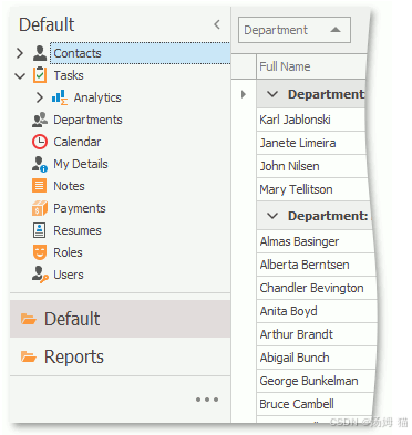
The ShowNavigationItemController populates the navigation Action Container with navigation Actions. ShowNavigationItemController reads the navigation structure and the navigation control style settings from the Application Model and customizes the navigation control accordingly. This Controller also synchronizes the selected item in the navigation control with the active View.
ShowNavigationItemController用导航操作填充导航操作容器。ShowNavigationItemController从应用程序模型中读取导航结构和导航控件样式设置,并相应地自定义导航控件。此控制器还将导航控件中的选定项目与活动视图同步。
2.The navigation structure reflects the relationship between different Views. The Application Model’s IModelRootNavigationItems node defines the navigation structure. The IModelRootNavigationItems node consists of IModelNavigationItem nodes. Each of the IModelNavigationItem nodes can have child nodes.
导航结构反映了不同视图之间的关系。应用模型的IModelRootNavigationItems节点定义了导航结构。IModelRootNavigationItems节点由IModelNavigationItem节点组成。每个IModelNavigationItem节点都可以有子节点。
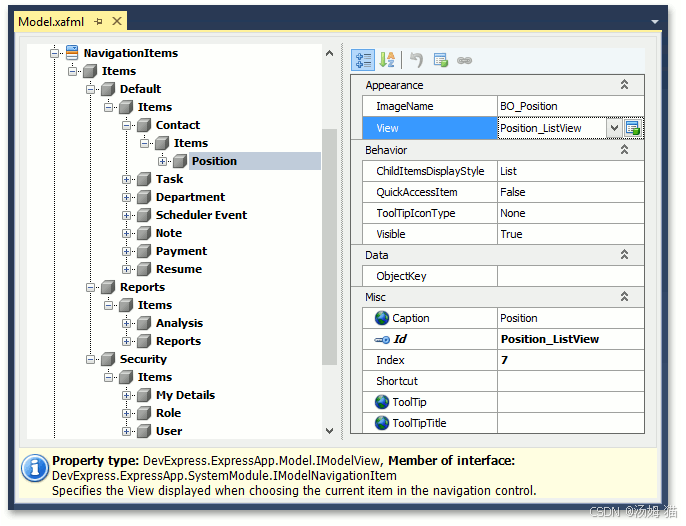
If a NavigationItem node has the IModelNavigationItem.View property set, the corresponding item in the navigation control corresponds to a View. Selecting such an item activates the View. If the View property is not set, the corresponding item in the navigation control serves as a group that stores other items.
如果NavigationItem节点设置了IModelNavigationItem. View属性,则导航控件中的相应项对应于View。选择这样的项将激活View。如果未设置View属性,则导航控件中的相应项用作存储其他项的组。
Define the Navigation Structure(定义导航结构)
You can define and customize the navigation structure at design time and in code.
您可以在设计时和代码中定义和自定义导航结构。
1.The Model Editor is meant for design-time customization of the navigation structure. Invoke the Model Editor, navigate to the NavigationItem node and customize it as required. This technique is detailed in the following tutorial: Add an Item to the Navigation Control.
模型编辑器用于设计时自定义导航结构。调用模型编辑器,导航到NavigationItem节点并根据需要对其进行自定义。以下教程中详细介绍了此技术:将项目添加到导航控件。
2.In code, you can do one of the following to define and customize the navigation structure:
在代码中,您可以执行以下操作之一来定义和自定义导航结构:
Apply the NavigationItemAttribute or DefaultClassOptionsAttribute to the required business classes. The NavigationItem attribute adds a navigation item to the navigation control. The most frequently used constructor accepts one string parameter that specifies a first-level child node of the NavigationItems node. The constructor adds a NavigationItem node that corresponds to the List View of the business class to the specified node. The DefaultClassOptions attribute produces the same effect as the NavigationItemAttribute but adds certain extra attributes. Refer to the DefaultClassOptionsAttribute class description for details.
将NavigationItemAttribute或DefaultClassOptionsAttribute应用到所需的业务类。NavigationItem属性将导航项添加到导航控件中。最常用的构造函数接受一个字符串参数,该参数指定NavigationItems节点的第一级子节点。构造函数将与业务类的List View对应的NavigationItem节点添加到指定节点。DefaultClassOptions属性产生与NavigationItemAttribute相同的效果,但添加了某些额外的属性。有关详细信息,请参阅DefaultClassOptionsAttribute类描述。
Customize the Application Model’s NavigationItems node directly, in a custom Controller, for instance. This technique is described in the following help topic: Access the Application Model in Code.
例如,在自定义控制器中直接自定义应用程序模型的NavigationItems节点。以下帮助主题中描述了此技术:在代码中访问应用程序模型。
Note
In ASP.NET WebForms and WinForms applications with the Navigation Bar and Accordion style, you cannot use a group to navigate to a View, even if the View property is specified because groups serve only as containers for other navigation items.
在具有导航栏和手风琴样式的ASP.NET WebForms和WinForms应用程序中,即使指定了View属性,也不能使用组导航到视图,因为组仅用作其他导航项的容器。
Define the Navigation Control Style in a WinForms Application(在WinForms应用程序中定义导航控件样式)
The following section illustrates the appearance of the navigation control in a WinForms application with different style settings.
以下部分说明了具有不同样式设置的WinForms应用程序中导航控件的外观。
Accordion
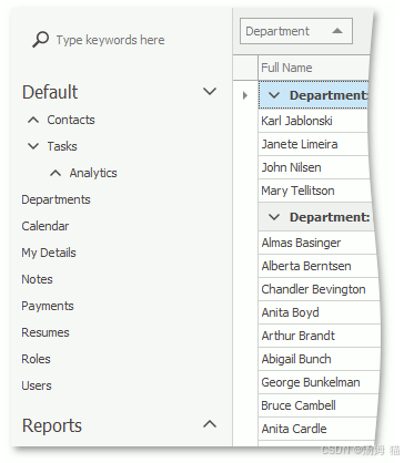
To apply this style to your WinForms application, set the IModelRootNavigationItems.NavigationStyle property to Accordion.
要将此样式应用于WinForms应用程序,请将IModelRootNavigationItems. NavigationStyle属性设置为 Accordion。
This is a default style for new XAF WinForms applications.
这是新XAF WinForms应用程序的默认样式。
All nodes except nodes of the last nesting level correspond to the accordion’s group elements.
除了最后嵌套级别的节点之外,所有节点都对应于 Accordion的组元素。
Navigation Bar with Large Icons
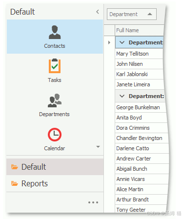
To apply this style to your WinForms application, do the following:
要将此样式应用于您的WinForms应用程序,请执行以下操作:
- Set the IModelRootNavigationItems.NavigationStyle property to NavBar.
将IModelRootNavigationItemsNavigationStyle属性设置为NavBar。 - Set the IModelRootNavigationItems.DefaultChildItemsDisplayStyle property to Large Icons.
将IModelRootNavigationItemsDefaultChildItemsDisplayStyle属性设置为大图标。
First-level child nodes are displayed in the navigation pane as navigation groups, and second-level child nodes are displayed as a set of icons.
第一级子节点在导航窗格中显示为导航组,第二级子节点显示为一组图标。
Navigation Bar with List
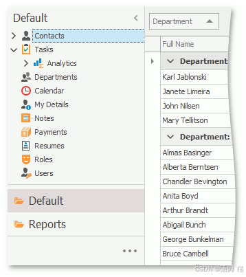
To apply this style to your WinForms application, do the following:
要将此样式应用于您的WinForms应用程序,请执行以下操作:
- Set the IModelRootNavigationItems.NavigationStyle property to NavBar.
将IModelRootNavigationItemsNavigationStyle属性设置为NavBar。 - Set the IModelRootNavigationItems.DefaultChildItemsDisplayStyle property to List.
将IModelRootNavigationItemsDefaultChildItemsDisplayStyle属性设置为List。
First-level child nodes are displayed in the navigation pane as navigation groups; content of each group is displayed as a tree list.
第一级子节点在导航窗格中显示为导航组;每个组的内容显示为树列表。
Tree List
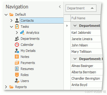
To apply this style to your WinForms application, set the IModelRootNavigationItems.NavigationStyle property to TreeList.
要将此样式应用于WinForms应用程序,请将IModelRootNavigationItems. NavigationStyle属性设置为TreeList。
All nodes are displayed as a tree list.
所有节点都显示为树列表。
Navigation Bar with Outlook Style
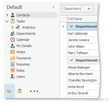
To apply this style to your WinForms application, do the following:
要将此样式应用于您的WinForms应用程序,请执行以下操作:
- Set the IModelRootNavigationItems.NavigationStyle property to NavBar.
将IModelRootNavigationItemsNavigationStyle属性设置为NavBar。 - Set the IModelRootGroupsStyle.RootGroupsStyle property to OutlookSimple or OutlookAnimated.
将IModelRootGroupsStyle. RootGroupsStyle属性设置为OutlookSimple或OutlookAnimated。 - Set the IModelOptionsWin.FormStyle property to Ribbon.
将IModelOptionsWin. FormStyle属性设置为Ribbon。 - Set the IModelOptionsWin.UIType property to SingleWindowSDI or MultipleWindowSDI.
将IModelOptionsWin. UIType属性设置为SingleWindowSDI或MultipleWindowSDI。 - In the WinApplication.Designer.cs (WinApplication.Designer.vb) file, set the WinApplication.UseOldTemplates property to false.
在WinApplication. Designer.cs(WinApplication.Designer.vb)文件中,将WinApplication.UseOldTemplate属性设置为false。
Each root navigation group is displayed as a NavigationBarItem in the Office Navigation Bar, and the group content is displayed as a TreeList (when the IModelChoiceActionItemChildItemsDisplayStyle.ChildItemsDisplayStyle property is set to List for the current group and this group has second-level child nodes) or as NavBarItems (when the ChildItemsDisplayStyle property is set to LargeIcons for the current group; only the first-level nodes are displayed).
每个根导航组在Office导航栏中显示为NavigationBarItem,组内容显示为TreeList(当IModelChoiceActionItemChildItemsDisplayStyle.ChildItemsDisplayStyle属性设置为当前组的List并且该组具有二级子节点时)或NavBarItems(当ChildItemsDisplayStyle属性设置为当前组的LargeIcons时;仅显示一级节点)。
Note
If you need to customize the navigation control’s appearance further, you can do it in code. You can implement a custom Controller and customize the control as required. The following help topic contains an a navigation control customization example: How to: Access Navigation Control.
如果您需要进一步自定义导航控件的外观,您可以在代码中完成。您可以实现自定义控制器并根据需要自定义控件。以下帮助主题包含一个导航控件自定义示例:如何:访问导航控件。
Define the Navigation Control Style in an ASP.NET Web Forms Application(在ASP.NETWeb窗体应用程序中定义导航控件样式)
The following section illustrates the appearance of the navigation control in an ASP.NET Web Forms application with different style settings.
以下部分说明了具有不同样式设置的ASP.NETWeb窗体应用程序中导航控件的外观。
Navigation Bar in the New Web UI
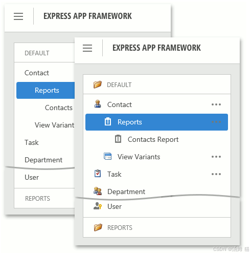
To apply this style to your ASP.NET Web Forms application, use the DefaultVerticalTemplateContentNew template with the IModelRootNavigationItems.NavigationStyle property set to NavBar. The first-level child nodes are displayed in the navigation pane as navigation groups, and the group content is displayed as a tree list.
要将此样式应用于ASP.NETWeb窗体应用程序,请使用DefaultVerticalTemplateContentNew模板,并将IModelRootNavigationItems. NavigationStyle属性设置为NavBar。第一级子节点在导航窗格中显示为导航组,组内容显示为树列表。
The IModelRootNavigationItems.ShowImages property specifies if icons are displayed for items and groups. Also, you can use the IModelRootNavigationItemsWeb.ShowNavigationOnStart property to hide the navigation pane when the application starts.
IModelRootNavigationItems. ShowImages属性指定是否显示项目和组的图标。此外,您可以使用IModelRootNavigationItemsWeb.ShowNavigationOnStart属性在应用程序启动时隐藏导航窗格。
Tree List in the New Web UI
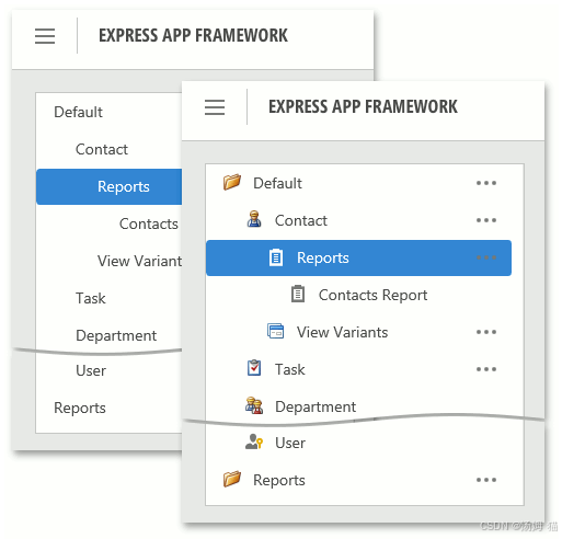
To apply this style to your ASP.NET Web Forms application, use the DefaultVerticalTemplateContentNew template with the IModelRootNavigationItems.NavigationStyle property set to TreeList. All nodes are displayed as a tree list.
要将此样式应用于ASP.NETWeb窗体应用程序,请使用DefaultVerticalTemplateContentNew模板,并将IModelRootNavigationItems. NavigationStyle属性设置为TreeList。所有节点都显示为树列表。
The IModelRootNavigationItems.ShowImages property specifies if icons are displayed for items and groups. Also, you can hide the navigation pane on start using the IModelRootNavigationItemsWeb.ShowNavigationOnStart property.
IModelRootNavigationItems. ShowImages属性指定是否显示项目和组的图标。此外,您可以在开始时使用IModelRootNavigationItemsWebShowNavigationOnStart属性隐藏导航窗格。
Vertical Navigation Bar in the Classic Web UI
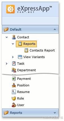
To apply this style to your ASP.NET Web Forms application, use the DefaultVerticalTemplateContent template with the IModelRootNavigationItems.NavigationStyle property set to NavBar.
要将此样式应用于ASP.NETWeb窗体应用程序,请使用DefaultVerticalTemplateContent模板,并将IModelRootNavigationItems. NavigationStyle属性设置为NavBar。
First-level child nodes are displayed in the navigation pane as navigation groups, and content of each group is displayed as a tree list.
第一级子节点在导航窗格中显示为导航组,每个组的内容显示为树列表。
Vertical Tree List in the Classic Web UI
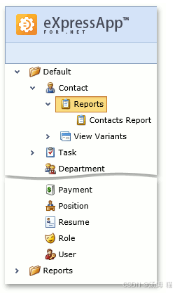
To apply this style to your ASP.NET Web Forms application, use the DefaultVerticalTemplateContent template with the IModelRootNavigationItems.NavigationStyle property set to TreeList.
要将此样式应用于ASP.NETWeb窗体应用程序,请使用DefaultVerticalTemplateContent模板,并将IModelRootNavigationItems. NavigationStyle属性设置为TreeList。
All nodes are displayed as a tree list.
所有节点都显示为树列表。
Horizontal Navigation Bar in the Classic Web UI
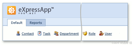
To apply this style to your ASP.NET Web Forms application, use the DefaultTemplateContent template.
要将此样式应用于ASP.NETWeb窗体应用程序,请使用DefaultTemplateContent模板。
First-level child nodes are displayed in the navigation pane as tabs, and second-level child notes are displayed as a set of icons along with captions.
第一级子节点在导航窗格中显示为选项卡,第二级子注释显示为一组图标和标题。
Define the Navigation Control Style in an ASP.NET Core Blazor Application(在ASP.NET核心Blazor应用程序中定义导航控件样式)
The following section illustrates the appearance of the navigation control in an ASP.NET Core Blazor application with different style settings.
以下部分说明了具有不同样式设置的ASP.NETCore Blazor应用程序中导航控件的外观。
Accordion
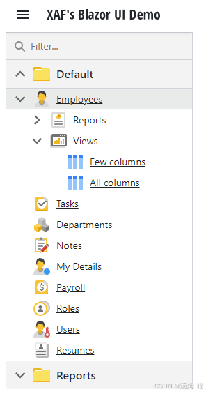
To apply this style to your Blazor application, set the IModelRootNavigationItems.NavigationStyle property to Accordion or NavBar.
要将此样式应用于Blazor应用程序,请将IModelRootNavigationItems. NavigationStyle属性设置为手风琴或NavBar。
This is the default style used in XAF Blazor applications.
这是XAF Blazor应用程序中使用的默认样式。
Tree List
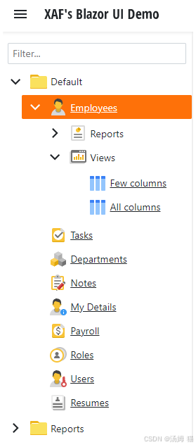
To apply this style to your Blazor application, set the IModelRootNavigationItems.NavigationStyle property to TreeList.
要将此样式应用于Blazor应用程序,请将IModelRootNavigationItems. NavigationStyle属性设置为TreeList。
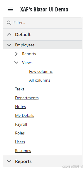
Show Images
Default navigation items display icons. To hide icons, set the IModelRootNavigationItems.ShowImages property to False.
默认导航项显示图标。要隐藏图标,请将IModelRootNavigationItems. ShowImages属性设置为False。
Context Navigation(上下文导航)
The navigation system supports context navigation. A module can track the item generation process in the navigation control. The module can add additional child navigation items to a created navigation item that meets specific criteria. The following built-in modules implement context navigation: Pivot Chart, Reports V2, and View Variants.
导航系统支持上下文导航。模块可以跟踪导航控件中的项目生成过程。该模块可以将额外的子导航项目添加到已创建的符合特定条件的导航项目中。以下内置模块实现上下文导航:透视图、报告V2和视图变体。
Context navigation is disabled for these modules. Use the following properties of the NavigationItems node to enable this feature:
这些模块的上下文导航已禁用。使用NavigationItems节点的以下属性来启用此功能:
- IModelPivotChartNavigation.GenerateRelatedAnalysisGroup
- IModelNavigationItemsForReports.GenerateRelatedReportsGroup
- IModelNavigationItemsVariantSettings.GenerateRelatedViewVariantsGroup
Use the following properties of the NavigationItems node to customize context navigation group captions:
使用NavigationItems节点的以下属性自定义上下文导航组标题:
- IModelPivotChartNavigation.RelatedAnalysisGroupCaption
- IModelNavigationItemsForReports.RelatedReportsGroupCaption
- IModelNavigationItemsVariantSettings.RelatedViewVariantsGroupCaption
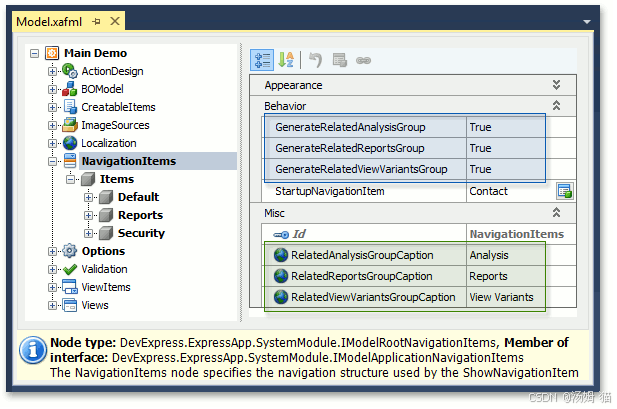
The ViewVariants module adds the View Variants navigation items for the Views that have predefined View variants. The Analysis and Report modules add navigation items for business classes associated with existing analysis/report objects.
ViewVariants模块为具有预定义视图变体的视图添加视图变体导航项。分析和报告模块为与现有分析/报告对象关联的业务类添加导航项。
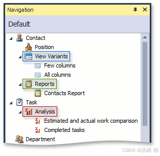
You can also implement custom context navigation. To see an example, refer to the following help topic: How to: Implement Custom Context Navigation.
您还可以实现自定义上下文导航。要查看示例,请参阅以下帮助主题:如何:实现自定义上下文导航。
Keyboard Shortcuts in WinForms Applications(WinForms应用程序中的键盘快捷方式)
When you use the Multiple Document Interface in the application, hold down the Shift key and click a navigation item to invoke a new View in a separate window instead of a new tab.
当您在应用程序中使用多文档界面时,按住Shift键并单击导航项以在单独的窗口而不是新选项卡中调用新视图。
You can use arrow keys to navigate a tree list control. Click a tree list region that is not occupied by navigation items to enter keyboard navigation mode. Use the up arrow and down arrow keys to navigate between items. To expand a group item, press ctrl+right arrow. To collapse a group item, press ctrl+left arrow.
您可以使用箭头键浏览树列表控件。单击未被导航项占用的树列表区域以进入键盘导航模式。使用向上箭头和向下箭头键在项目之间导航。要展开组项目,请按ctrl+右箭头。要折叠组项目,请按ctrl+左箭头。

北京人形旗下天工造物具身智能开源社区,聚焦具身天工与慧思开物两大平台
更多推荐
 30
30 0
0- 0


 已为社区贡献1条内容

所有评论(0)