微信小程序轮播图组件Swiper全解析
·
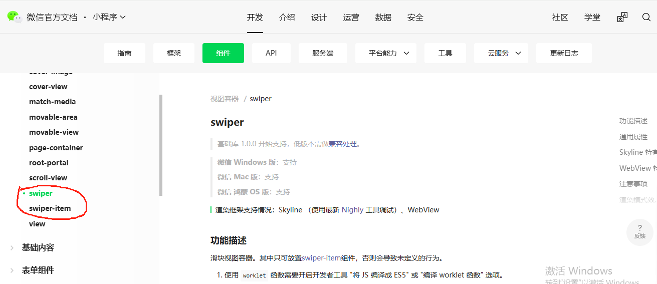
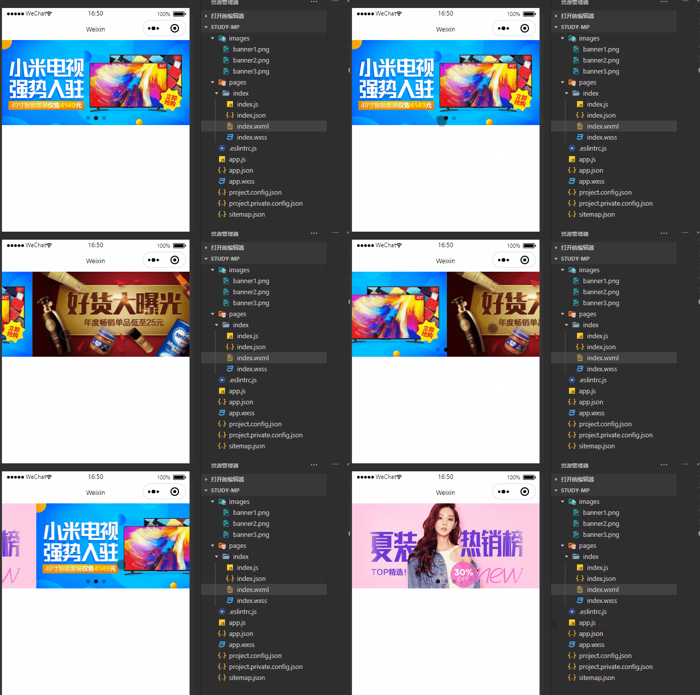
微信小程序内置的轮播图组件是 swiper,它用于实现图片或内容的滑动展示。下面将详细讲解 swiper 组件的所有常用属性,并通过完整代码示例说明其用法,最后以表格形式总结。
官网参考: https://developers.weixin.qq.com/miniprogram/dev/component/swiper.html
一、基本结构与使用方法
<swiper> 是微信小程序内置的轮播组件,常用于实现图片轮播或内容滑动展示。每个轮播项由 <swiper-item> 包裹。
示例代码(WXML)
<!-- index.wxml -->
<view class="container">
  <swiper
    autoplay="{{autoplay}}"           <!-- 是否自动播放 -->
    interval="{{interval}}"           <!-- 自动播放间隔时间 -->
    duration="{{duration}}"           <!-- 滑动动画时长 -->
    circular="{{circular}}"           <!-- 是否循环播放 -->
    vertical="{{vertical}}"           <!-- 是否纵向滑动 -->
    previous-margin="{{prevMargin}}"  <!-- 前边距 -->
    next-margin="{{nextMargin}}"      <!-- 后边距 -->
    current="{{current}}"             <!-- 当前索引 -->
    bindchange="onChange"             <!-- 切换事件 -->
    bindtap="onTap"                    <!-- 点击事件 -->
    disable-touch="{{disableTouch}}"  <!-- 是否禁用拖动 -->
    skip-hidden-item-layout="{{skipHiddenLayout}}" <!-- 是否跳过隐藏项布局 -->
    easing-function="{{easingFunction}}" <!-- 动画缓动函数 -->
  >
    <!-- 轮播项 -->
    <block wx:for="{{banners}}" wx:key="index">
      <swiper-item>
        <image src="{{item}}" mode="aspectFill" />
      </swiper-item>
    </block>
  </swiper>

  <!-- 控制按钮 -->
  <button bindtap="toggleAutoplay">{{autoplay ? '暂停' : '开始'}}</button>
</view>
二、JS 数据定义与事件处理(index.js)
Page({
  data: {
    banners: [
      'https://example.com/banner1.jpg',
      'https://example.com/banner2.jpg',
      'https://example.com/banner3.jpg'
    ],
    autoplay: true,
    interval: 3000,
    duration: 500,
    circular: true,
    vertical: false,
    prevMargin: 20,
    nextMargin: 20,
    current: 0,
    disableTouch: false,
    skipHiddenLayout: true,
    easingFunction: 'default'
  },

  // 切换自动播放状态
  toggleAutoplay() {
    this.setData({ autoplay: !this.data.autoplay });
  },

  // 轮播图切换回调
  onChange(e) {
    const current = e.detail.current;
    console.log('当前轮播图索引:', current);
    this.setData({ current });
  },

  // 点击轮播图回调
  onTap() {
    console.log('轮播图被点击');
  }
});
三、WXSS 样式定义(index.wxss)
.container {
  padding: 20rpx;
}

swiper {
  height: 300rpx;
  border-radius: 16rpx;
  overflow: hidden;
}

swiper image {
  width: 100%;
  height: 100%;
}
四、<swiper> 属性详解与可选项说明
| 属性名 | 类型 | 默认值 | 可选值 | 描述 |
|---|---|---|---|---|
autoplay | Boolean | false | true / false | 是否自动播放 |
interval | Number | 5000 | - | 自动播放间隔时间(毫秒) |
duration | Number | 500 | - | 滑动动画持续时间(毫秒) |
circular | Boolean | false | true / false | 是否循环播放(衔接) |
vertical | Boolean | false | true / false | 是否纵向滑动 |
previous-margin | Number | 0 | - | 左侧/上方滑块露出部分宽度(px) |
next-margin | Number | 0 | - | 右侧/下方滑块露出部分宽度(px) |
current | Number | 0 | - | 初始显示第几个滑块(从0开始) |
bindchange | EventHandle | - | - | 滑块切换时触发事件,event.detail.current 表示当前索引 |
bindtap | EventHandle | - | - | 点击滑块时触发事件 |
disable-touch | Boolean | false | true / false | 是否禁用用户拖动切换 |
skip-hidden-item-layout | Boolean | false | true / false | 是否跳过隐藏滑块的布局计算,优化性能 |
easing-function | String | “default” | "default", "linear", "easeInCubic", "easeOutCubic", "easeInOutCubic" | 动画缓动函数 |
五、<swiper-item> 使用说明
<swiper-item>必须作为<swiper>的直接子元素。- 支持嵌套任意组件,如
<image>,<text>,<view>等。 - 不建议在
<swiper-item>中使用flex或grid布局,容易导致渲染异常。
六、注意事项
swiper高度必须显式设置,否则可能不显示。- 图片推荐使用
mode="aspectFill"以适应容器并保持比例。 - 使用
circular时,如果数据量小于等于1,不会生效。 - 如果想在页面加载时默认定位到某张图片,可通过
current控制初始位置。 easing-function支持多种缓动函数,适用于自定义动画效果。
七、总结表格:<swiper> 标签常用属性一览
| 属性名 | 类型 | 默认值 | 可选值 | 描述 |
|---|---|---|---|---|
autoplay | Boolean | false | true / false | 是否自动播放 |
interval | Number | 5000 | - | 自动播放间隔时间(ms) |
duration | Number | 500 | - | 滑动动画持续时间(ms) |
circular | Boolean | false | true / false | 是否循环播放 |
vertical | Boolean | false | true / false | 是否纵向滑动 |
previous-margin | Number | 0 | - | 前边距(px) |
next-margin | Number | 0 | - | 后边距(px) |
current | Number | 0 | - | 当前索引 |
bindchange | EventHandle | - | - | 切换事件 |
bindtap | EventHandle | - | - | 点击事件 |
disable-touch | Boolean | false | true / false | 是否禁用拖动 |
skip-hidden-item-layout | Boolean | false | true / false | 是否跳过隐藏项布局 |
easing-function | String | “default” | 见上表 | 动画缓动函数 |
八、结语
<swiper> 是微信小程序中非常常用的组件,支持丰富的配置项,能够满足轮播图、广告位、引导页等多种场景需求。结合 <swiper-item> 和动态数据绑定,可以轻松实现交互性强的轮播效果。
建议在开发过程中多使用开发者工具调试样式和行为表现,确保在不同设备上都能良好展示。

北京人形旗下天工造物具身智能开源社区,聚焦具身天工与慧思开物两大平台
更多推荐
 5
5 0
0- 0


 已为社区贡献30条内容

所有评论(0)