flutter_slidable 插件使用
·
简介
flutter_slidable 是一个用于创建可滑动列表项的 Flutter 插件,它允许用户通过滑动来显示隐藏的操作按钮,比如删除、分享等功能。
安装
在 pubspec.yaml 中添加依赖(并运行 flutter pub get):
dependencies:
  flutter_slidable: ^4.0.0
基本使用
- 导入包
import 'package:flutter_slidable/flutter_slidable.dart';
- 基本结构
Slidable 的基本结构包含以下几个主要部分:
Slidable(
  key: ValueKey(item), // 唯一标识
  endActionPane: ActionPane( // 滑动操作面板
    motion: ScrollMotion(), // 滑动动画
    children: [ // 操作按钮列表
      SlidableAction(...),
      SlidableAction(...),
    ],
  ),
  child: ListTile(...), // 主要内容
)
- 完整示例
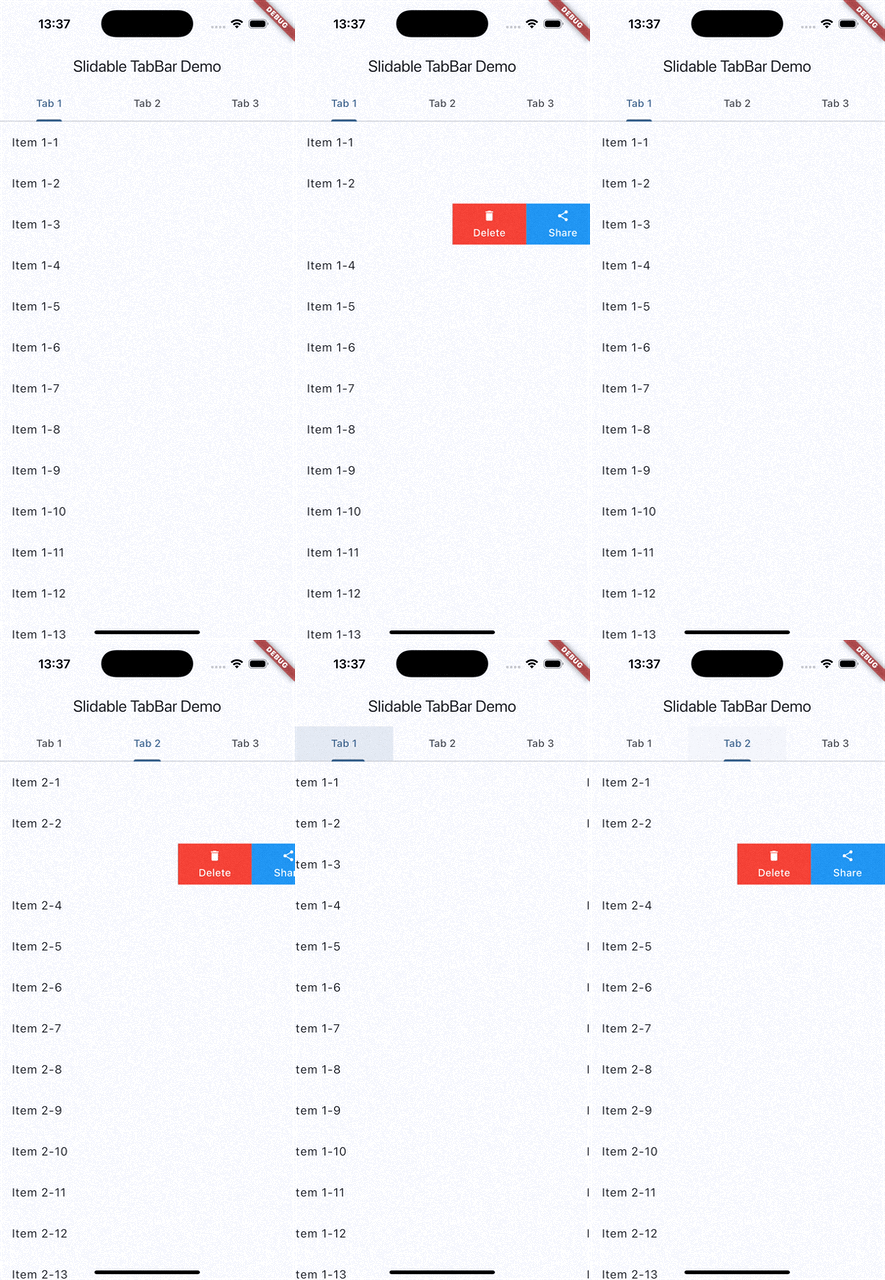
下面是一个结合 TabBar 的完整示例:
import 'package:flutter/material.dart';
import 'package:flutter_slidable/flutter_slidable.dart';

void main() {
  runApp(const MyApp());
}

class MyApp extends StatelessWidget {
  const MyApp({super.key});

  @override
  Widget build(BuildContext context) {
    return MaterialApp(
      title: 'Slidable TabBar Demo',
      theme: ThemeData(
        colorScheme: ColorScheme.fromSeed(seedColor: Colors.blue),
        useMaterial3: true,
      ),
      home: const MyHomePage(),
    );
  }
}

class MyHomePage extends StatefulWidget {
  const MyHomePage({super.key});

  @override
  State<MyHomePage> createState() => _MyHomePageState();
}

class _MyHomePageState extends State<MyHomePage> with TickerProviderStateMixin {
  late TabController _tabController;
  final List<String> _tabs = ['Tab 1', 'Tab 2', 'Tab 3'];
  final List<List<String>> _items = [
    List.generate(20, (index) => 'Item 1-${index + 1}'),
    List.generate(20, (index) => 'Item 2-${index + 1}'),
    List.generate(20, (index) => 'Item 3-${index + 1}'),
  ];

  @override
  void initState() {
    super.initState();
    _tabController = TabController(length: _tabs.length, vsync: this);
  }

  @override
  void dispose() {
    _tabController.dispose();
    super.dispose();
  }

  @override
  Widget build(BuildContext context) {
    return Scaffold(
      appBar: AppBar(
        title: const Text('Slidable TabBar Demo'),
        bottom: TabBar(
          controller: _tabController,
          tabs: _tabs.map((String tab) => Tab(text: tab)).toList(),
        ),
      ),
      body:
      SlidableAutoCloseBehavior( // 自动关闭其他Slidable
        child:  TabBarView(
        controller: _tabController,
        children: _items.map((tabItems) => KeepAliveListView(items: tabItems)).toList(),
      ),
      ),

    );
  }
}

class KeepAliveListView extends StatefulWidget {
  final List<String> items;

  const KeepAliveListView({
    super.key,
    required this.items,
  });

  @override
  State<KeepAliveListView> createState() => _KeepAliveListViewState();
}

// 保持状态的生命周期
class _KeepAliveListViewState extends State<KeepAliveListView>
    with AutomaticKeepAliveClientMixin
    {
  @override
  bool get wantKeepAlive => true; // 必须实现

  @override
  Widget build(BuildContext context) {
    super.build(context); // 必须调用
    return ListView.builder(
      itemCount: widget.items.length,
      itemBuilder: (context, index) {
        return Slidable(
          key: ValueKey(widget.items[index]),
          endActionPane:
          // 滑动动作面板,可以自定义
          ActionPane(
            motion: const ScrollMotion(),
            children: [

              SlidableAction(
                onPressed: (context) {

                  ScaffoldMessenger.of(context).showSnackBar(
                    SnackBar(content: Text('Delete ${widget.items[index]}')),
                  );
                  // 删除操作
                  if (mounted){
                      setState(() {
                    widget.items.removeAt(index);
                  });
                  }

                },
                backgroundColor: Colors.red,
                foregroundColor: Colors.white,
                icon: Icons.delete,
                label: 'Delete',
              ),
              SlidableAction(
                onPressed: (context) {
                  ScaffoldMessenger.of(context).showSnackBar(
                    SnackBar(content: Text('Share ${widget.items[index]}')),
                  );

                   if (mounted){
                      setState(() {
                    widget.items.removeAt(index);
                  });
                  }
                },
                backgroundColor: Colors.blue,
                foregroundColor: Colors.white,
                icon: Icons.share,
                label: 'Share',
              ),
            ],
          ),
          child: ListTile(
            title: Text(widget.items[index]),
          ),
        );
      },
    );
  }
}
核心功能说明
- SlidableAutoCloseBehavior
用于自动关闭其他已打开的滑动项:
SlidableAutoCloseBehavior(
  child: yourWidget,
)
- ActionPane
定义滑动操作面板:
ActionPane(
  motion: ScrollMotion(), // 滑动动画效果
  children: [
    SlidableAction(
      onPressed: (context) {
        // 处理点击事件
      },
      backgroundColor: Colors.red,
      foregroundColor: Colors.white,
      icon: Icons.delete,
      label: 'Delete',
    ),
  ],
)
- 滑动方向
Slidable 支持从左侧或右侧滑动:- startActionPane: 从左侧滑动显示
- endActionPane: 从右侧滑动显示
- 状态保持
结合 AutomaticKeepAliveClientMixin 保持滑动列表状态:
class _KeepAliveListViewState extends State<KeepAliveListView>
    with AutomaticKeepAliveClientMixin {
  @override
  bool get wantKeepAlive => true;

   @override
  Widget build(BuildContext context) {
    super.build(context); // 必须调用
    }
}
结语
通过本篇文章,相信你已经知道如何使用 flutter_slidable 插件,并轻松实现丰富的滑动交互功能。
感谢您的阅读和参与,HH思无邪愿与您一起在技术的道路上不断探索。如果您喜欢这篇文章,不妨留下您宝贵的赞!如果您对文章有任何疑问或建议,欢迎在评论区留言,我会第一时间处理,您的支持是我前行的动力,愿我们都能成为更好的自己!

北京人形旗下天工造物具身智能开源社区,聚焦具身天工与慧思开物两大平台
更多推荐
 6
6 0
0- 0


 已为社区贡献2条内容

所有评论(0)