flutter 弹窗自己关闭_【Flutter】Flutter底部弹窗ModalBottomSheet详解
·
Flutter底部弹窗showModalBottomSheet()详解
分两部分内容,基础参数设置和显示高度调整
修改高度为自适应,请查看【Flutter】Flutter底部弹窗ModalBottomSheet详解2,设置高度为包裹内容
构造函数参数详解
Future<T> showModalBottomSheet<T>({
  @required BuildContext context,
  @required WidgetBuilder builder,
  Color backgroundColor,
  double elevation,
  ShapeBorder shape,
  Clip clipBehavior,
  Color barrierColor,
  bool isScrollControlled = false,
  bool useRootNavigator = false,
  bool isDismissible = true,
  bool enableDrag = true,
})- builder:构造内容
- backgroundColor:背景颜色指的是显示内容下面的颜色,要设置圆角弹窗,该项使用null,默认是灰白色,根据系统主题
- elevation :阴影高度,没看出效果
- ShapeBorder: 边线,可以指定单边或者多边,还可以是圆形的,ShapeBorder的子类都可以,还可以设置圆角
- clipBehavior :widget剪裁模式,分none、hardEdge、antiAlias、antiAliasWithSaveLayer,效率依次降低,效果依次提高
- barrierColor: 蒙版颜色,就是遮住原页面内容的半透明黑色,默认是Colors.black54
- isScrollControlled :是否可滚动,用于调整内容部分的高度的模式,后面展开详细
- useRootNavigator: 一般用不上
官方解释:/// If `rootNavigator` is set to true, the state from the furthest instance of /// this class is given instead. Useful for pushing contents above all subsequent /// instances of [Navigator].
- isDismissible :点击外部区域是否关闭弹窗,默认true
- enableDrag: 启用拖拽功能,拖动弹窗关闭,默认true
看下面的图,基本把能设置的属性都设置上了,源码在图下方
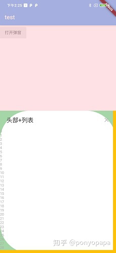
showModalBottomSheet(
            context: context,
            backgroundColor: Colors.green[200],
            barrierColor: Color(0x8DFFCDD2),//半透明红色
//这里是圆形的边线
//          shape: CircleBorder(
//                side: BorderSide(
//              color: Colors.amber,
//              width: 5,
//            )),
            shape: Border(
            //底部边线
              bottom: BorderSide(
                color: Colors.amber,
                width: 10,
              ),
              //右边边线
              right: BorderSide(
                color: Colors.amber,
                width: 10,
              ),
            ),
            isDismissible: true,
            enableDrag: true,
            builder: (context) {
              return Container(
              //设置背景颜色为白色,并且设置3个角圆角
                decoration: BoxDecoration(
                  color: Colors.white,
                  borderRadius: BorderRadius.only(
                      topLeft: Radius.circular(100),
                      topRight: Radius.circular(100),
                      bottomLeft: Radius.circular(100)),
                ),
                child: ....
             }
弹窗高度设置
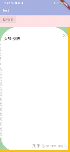
isScrollControlled设置true时窗会变成全屏弹窗,查看下源码,提取核心逻辑
@override
  BoxConstraints getConstraintsForChild(BoxConstraints constraints) {
    return BoxConstraints(
      minWidth: constraints.maxWidth,
      maxWidth: constraints.maxWidth,
      minHeight: 0.0,
      maxHeight: isScrollControlled
        ? constraints.maxHeight
        : constraints.maxHeight * 9.0 / 16.0,
    );
  }
该段逻辑的意思就是从弹窗layout计算时的constraints的获取尺寸(传入的宽高约束是layout时根据child计算的),将弹窗内容宽度无脑设为child的最大值(实际测试宽度都是屏幕宽度,不可调整),高度的话isScrollControlled=true时设置为最大值,否则设置是constraints.maxHeight * 9.0 / 16.0,在内容部分不设置约束时constraints.maxHeight就是屏幕高度,接下就可以自己设置高度了。
showModalBottomSheet(
    context: context,
    isScrollControlled: true,
    builder: (context) {
              return Container(
                decoration: BoxDecoration(
                  color: Colors.white,
                ),
                constraints: BoxConstraints(maxHeight: 700),//设置maxHeight为你想要的数字就行
   }
)
源码地址:https://github.com/ZXQ-Kyle/Flutter_widget_test/blob/master/show_modal_bottom_sheet.dart

北京人形旗下天工造物具身智能开源社区,聚焦具身天工与慧思开物两大平台
更多推荐
 0
0 0
0- 0


 已为社区贡献7条内容

所有评论(0)