

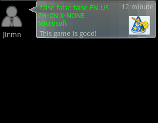
这里主要可学习有两点,一点是定位的设计。
< LinearLayout xmlns:android ="http://schemas.android.com/apk/res/android"
android:layout_height ="fill_parent" android:layout_width ="fill_parent"
android:orientation ="horizontal" >
< LinearLayout android:layout_height ="wrap_content"
android:layout_width ="wrap_content" android:orientation ="vertical" >
< ImageView android:layout_height ="wrap_content" android:id ="@+id/UserPic"
android:layout_marginTop ="10px" android:src ="@drawable/ic_search_user_gray"
android:layout_width ="wrap_content" ></ ImageView >
< TextView android:layout_height ="wrap_content" android:id ="@+id/UserName"
android:padding ="5px" android:layout_width ="wrap_content"
android:text ="Jinmn" ></ TextView >
</ LinearLayout >
< LinearLayout android:layout_height ="wrap_content"
android:paddingLeft ="10px" android:layout_width ="fill_parent" >
< RelativeLayout android:layout_height ="80px"
android:background ="@drawable/share_item_two_bg" android:paddingLeft ="10px"
android:id ="@+id/ShareHollItem" android:layout_width ="fill_parent" >
< TextView android:layout_width ="wrap_content"
android:layout_height ="wrap_content"
android:text =" false false false EN-US ZH-CN X-NONE Microsoft"
android:maxWidth ="150dip"
android:layout_alignParentLeft="true" android:layout_alignParentTop="true"
android:layout_marginTop ="5px" android:layout_marginLeft ="10px"
android:textColor ="#00ff00" android:id ="@+id/ShareHollTitle" ></ TextView >
< TextView android:layout_width ="wrap_content"
android:layout_height ="wrap_content" android:text ="This game is good!"
android:layout_alignBottom ="@+id/ShareHollTitle"
android:layout_alignParentLeft ="true"
android:layout_alignParentBottom="true" android:layout_marginLeft ="10px"
android:padding ="3px" android:id ="@+id/ShareHollContent" ></ TextView >
< TextView android:layout_width ="wrap_content"
android:layout_alignParentRight ="true" android:layout_margin ="3px"
android:layout_alignParentTop ="true" android:layout_height ="wrap_content"
android:text ="12 minute" android:id ="@+id/ShareHollTime" ></ TextView >
< ImageView android:layout_height ="wrap_content" android:id ="@+id/CommentPic"
android:layout_alignParentRight ="true" android:layout_margin ="5px"
android:layout_alignParentBottom ="true" android:src ="@drawable/magic"
android:padding ="5px"
android:layout_width ="wrap_content" ></ ImageView >
</ RelativeLayout >
</ LinearLayout >
</ LinearLayout >
黑色的部分就是定位的重点,剩余的就是配合上 layout_margin和padding 控制UI在layout显示的位置
另一点是9宫格的设计(其实图标的设计涉及的技巧很多,这里我也只是提一提,更具体的可以上官网看,也可以下载eoe第11期的UI设计PDF看看)。
代码中浅蓝色部分是引用了一张9宫格的图片(android:background="@drawable/share_item_two_bg ) 该图片原样如下:
截取网上一篇文章的内容
/****************************************************************************************************
这里介绍一下9宫格的意思和使用,最后才介绍该图片怎么使用的效果
这个九宫格绘画工具(draw9patch.bat)可以让你很容易的通过一个所见即所得(WYS|WYG)的编辑器来创建一个九宫格NinePatch图。
在做项目中发现图片后面有.9.png ,但是复制进入资源文件里就发生错误。
什么是 .9.png?
9.png 格式的文件的特点
与传统的png 格式图片相比, 9.png 格式图片在图片四周有一圈一个像素点组成的边沿,该边沿用于对图片的可扩展区和内容显示区进行定义。
这种格式的图片在android 环境下具有自适应调节大小的能力。
(1)允许开发人员定义可扩展区域,当需要延伸图片以填充比图片本身更大区域时,可扩展区的内容被延展。
(2)允许开发人员定义内容显示区,用于显示文字或其他内容
如下图所示:
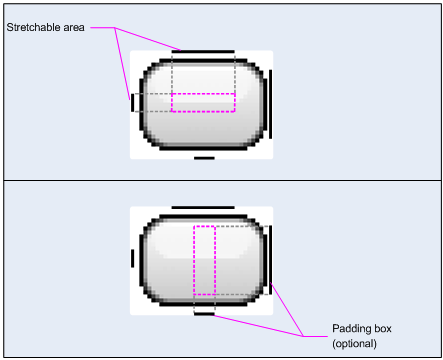
左侧和上方的黑线交叉的部分即可扩展区域
右侧和下方的黑线交叉的部分即内容显示区
******************************************************************************************************/
其实从上面那张图就可以看出图片的左方和上方的黑线就是图片向四周扩大的基本,总之凡是扩大出来的图片那么多出来的地方就是那两条黑线相交后的红色区域。
而下方和右方的黑线就是内容的显示(即该背景上面UI的组件)。不过左方和上方的黑线也具有内容显示的功能(这个我也不知道是不是,但是做实验时又可以显示.....)。
如果我将下方和右方的黑线都去掉,这样做出来的效果就像这样:
 效果:
效果: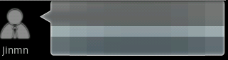
该背景上的内容都被遮住了,中间那条东东就是填充的内容的扩展。
就介绍到这里。其实因为有了这样的内容填充,所以我们可以利用它来做很多事件,如游戏的加载进度条。背景图片就只给它一条中间的填充内容显示,这样就可以不用用太多时间去控制中间图片的定位。
该项目只在320x480下测试,其他分辨率会发生定位偏移
项目原件
http://files.cnblogs.com/not-code/seaBackgroundQuestion.rar
本文为原创,如需转载,请注明作者和出处,谢谢!


 已为社区贡献1条内容

所有评论(0)