css实现四边形四角边框效果(没有使用定位,避免布局影响)
·
实现下面这种效果
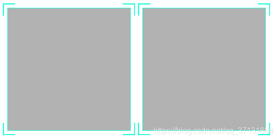
开发中要实现下面这种效果,相信大家第一眼就会想到用定位,直接把四个边框定位上去就好了。
最开始我也是直接用的定位,封装成了一个组件。后面布局的时候出问题了,排列的时候很麻烦,对不起,调位置什么的都不好控制,而且因为要做到自适应,很不好做。后面想了很久,感觉可以用css的背景属性来做,这样的话这些问题全部都可以避免了。
直接上代码
这个html文件,可以复制直接看下
<head>
    <meta charset="UTF-8">
    <meta name="viewport" content="width=device-width, initial-scale=1.0">
    <title>Document</title>
    <style>
        .frame {
            display: inline-block;
            padding: 7px;
            background: linear-gradient(#00ffd4, #00ffd4) left top, linear-gradient(#00ffd4, #00ffd4) left top, linear-gradient(#00ffd4, #00ffd4) right top, linear-gradient(#00ffd4, #00ffd4) right top, linear-gradient(#00ffd4, #00ffd4) left bottom, linear-gradient(#00ffd4, #00ffd4) left bottom, linear-gradient(#00ffd4, #00ffd4) right bottom, linear-gradient(#00ffd4, #00ffd4) right bottom;
            background-repeat: no-repeat;
            background-size: 2px 20px, 20px 2px;
        }

        .frame-box {
            width: 200px;
            height: 200px;
            border: #00ffd4 1px solid;
            background: rgba(0, 0, 0, 0.3);
        }
    </style>
</head>

<body>
    <div class="frame">
        <div class="frame-box">
        </div>
    </div>
    <div class="frame">
        <div class="frame-box">
        </div>
    </div>
</body>

</html>
当然,我项目是vue的,直接封装成一个样式组件,利用vue的<slot />标签,插槽。就可以直接想怎么用就怎么用啦,开心。
组件代码
<template>
  <div class="frame">
    <div class="frame-box">
      <slot />
    </div>
  </div>
</template>

<script>
export default {

}

</script>

<style  lang="scss" scoped>
.frame {
  padding: 7px;
  background: linear-gradient(#00ffd4, #00ffd4) left top,
    linear-gradient(#00ffd4, #00ffd4) left top,
    linear-gradient(#00ffd4, #00ffd4) right top,
    linear-gradient(#00ffd4, #00ffd4) right top,
    linear-gradient(#00ffd4, #00ffd4) left bottom,
    linear-gradient(#00ffd4, #00ffd4) left bottom,
    linear-gradient(#00ffd4, #00ffd4) right bottom,
    linear-gradient(#00ffd4, #00ffd4) right bottom;
  background-repeat: no-repeat;
  background-size: 2px 20px, 20px 2px;
}
.frame-box {
  width: 100%;
  height: 100%;
  border: #00ffd4 1px solid;
  background: rgba(0, 0, 0, 0.6);
}
</style>

北京人形旗下天工造物具身智能开源社区,聚焦具身天工与慧思开物两大平台
更多推荐
 3
3 0
0- 0


 已为社区贡献2条内容

所有评论(0)