css导航栏固定顶部两种情况,及绝对定位,相对定位,固定定位和粘性定位的特性及区别
·
绝对定位,相对定位,固定定位和粘性定位的特性及区别,我整理一下放在文章最下面了,不用死记硬背,理解一下就ok,需要的话可以看看。
当导航栏头部没有别的模块时,想要滑动过程中导航栏一直在顶部,有两种写法
1.粘性定位(position: sticky;)
效果图:

css全部代码:
* {
				margin: 0;
				padding: 0;
			}

			li {
				list-style: none;
			}

			a {
				text-decoration: none;
				color: white;
			}

			.wrapper {
				width: 100%;
				height: 5000px;
				/* 圆形边框 */
			}

			.box {
				width: 1250px;
				margin: 0 auto;
				background-color: dimgray;
				height: 50px;
				border: 1px solid white;
				border-radius: 20px 20px;
				position: sticky;
				top: 0;
				/* 固定在距离顶部0px处 */
			}

			.box>ul>li {
				float: left;
				position: relative;
			}

			.nav {
				width: 1200px;
				margin: 0 auto;
			}

			.box ul li {
				height: 50px;
				line-height: 50px;
				width: 200px;
				background-color: dimgrey;
				text-align: center;
				font-weight: bolder;
				border-radius: 20px 20px;
			}

			.nav li:nth-of-type(2) ul {
				display: none;
				/* 隐藏二级菜单*/
				position: absolute;
			}

			.nav li:hover>a {
				color: darkred;
			}

			/* 鼠标悬浮字体变色 */

			.nav li:nth-of-type(2):hover .second {
				display: block;
				/* 鼠标悬浮显示二级菜单*/
			}

			.third {
				position: absolute;
				top: 100px;
				left: 200px;
				display: none;
				/* 隐藏三级菜单 */
			}

			.second li:nth-of-type(3):hover ul {
				display: block;
				/* 鼠标悬浮显示三级菜单*/
			}
html:全部代码
<div class="wrapper">
			<div class="box">
				<ul class="nav">
					<li><a href="#">首页</a></li>
					<li><a href="#">网上工作室</a>
						<ul class="second">
							<li><a href="#">游客</a></li>
							<li><a href="#">工作人员</a></li>
							<li><a href="#">管理层</a>
								<ul class="third">
									<li><a href="#">普通管理层</a></li>
									<li><a href="#">vip</a></li>
									<li><a href="#">svip</a></li>
								</ul>
							</li>
						</ul>
					</li>
					<li><a href="#">交流圈</a></li>
					<li><a href="#">登录</a></li>
					<li><a href="#">注册</a></li>
					<li><a href="#">联系我们</a></li>
				</ul>
			</div>
		</div>
2.固定定位(position: fixed;)并且,我们发现margin: 0 auto;失效了,也就是说,使用固定定位和绝对定位都会脱离标准文档流,使margin: 0 auto;失效。
效果图:
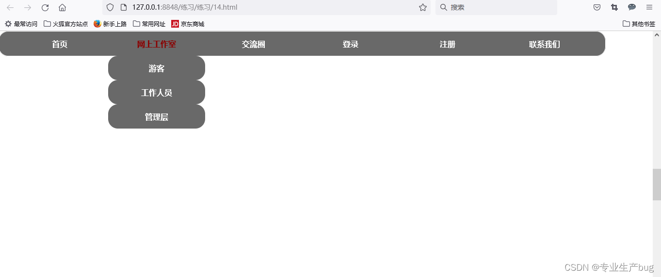
css全部代码:
* {
				margin: 0;
				padding: 0;
			}

			li {
				list-style: none;
			}

			a {
				text-decoration: none;
				color: white;
			}

			.wrapper {
				width: 100%;
				height: 5000px;
				/* 圆形边框 */
			}
			/* .header{
				width: 100%;
				height: 500px;
				background-color: burlywood;
			} */

			 .box {
				width: 1250px;
				/* margin: 0 auto; */
				background-color: dimgray;
				height: 50px;
				border: 1px solid white;
				border-radius: 20px 20px;
				position:fixed;
				top: 0;
				/* 固定在距离顶部0px处 */
			}

			.box>ul>li {
				float: left;
				position: relative;
			}

			.nav {
				width: 1200px;
				margin: 0 auto;
			}

			.box ul li {
				height: 50px;
				line-height: 50px;
				width: 200px;
				background-color: dimgrey;
				text-align: center;
				font-weight: bolder;
				border-radius: 20px 20px;
			}

			.nav li:nth-of-type(2) ul {
				display: none;
				/* 隐藏二级菜单*/
				position: absolute;
			}

			.nav li:hover>a {
				color: darkred;
			}

			/* 鼠标悬浮字体变色 */

			.nav li:nth-of-type(2):hover .second {
				display: block;
				/* 鼠标悬浮显示二级菜单*/
			}

			.third {
				position: absolute;
				top: 100px;
				left: 200px;
				display: none;
				/* 隐藏三级菜单 */
			}

			.second li:nth-of-type(3):hover ul {
				display: block;
				/* 鼠标悬浮显示三级菜单*/
			}
html全部代码:
<div class="wrapper">
			<!-- <div class="header"></div> -->
			<div class="box">
				<ul class="nav">
					<li><a href="#">首页</a></li>
					<li><a href="#">网上工作室</a>
						<ul class="second">
							<li><a href="#">游客</a></li>
							<li><a href="#">工作人员</a></li>
							<li><a href="#">管理层</a>
								<ul class="third">
									<li><a href="#">普通管理层</a></li>
									<li><a href="#">vip</a></li>
									<li><a href="#">svip</a></li>
								</ul>
							</li>
						</ul>
					</li>
					<li><a href="#">交流圈</a></li>
					<li><a href="#">登录</a></li>
					<li><a href="#">注册</a></li>
					<li><a href="#">联系我们</a></li>
				</ul>
			</div>
		</div>
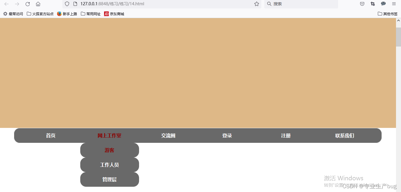
当导航栏头部有其他模块,想要滑动过程中,导航栏滑动与顶部零间距之后固定。
使用粘性定位滑动过程中与页面顶端不会产生空间,但此时,如果使用固定定位,那就真的会栓Q了,问题不大,就是效果不一样,可以试试。
使用粘性定位效果图:
css代码:
* {
				margin: 0;
				padding: 0;
			}

			li {
				list-style: none;
			}

			a {
				text-decoration: none;
				color: white;
			}

			.wrapper {
				width: 100%;
				height: 5000px;
				/* 圆形边框 */
			}
			.header{
				width: 100%;
				height: 500px;
				background-color: burlywood;
			}

			 .box {
				width: 1250px;
				margin: 0 auto;
				background-color: dimgray;
				height: 50px;
				border: 1px solid white;
				border-radius: 20px 20px;
				position: sticky;
				top: 0;
				/* 固定在距离顶部0px处 */
			}

			.box>ul>li {
				float: left;
				position: relative;
			}

			.nav {
				width: 1200px;
				margin: 0 auto;
			}

			.box ul li {
				height: 50px;
				line-height: 50px;
				width: 200px;
				background-color: dimgrey;
				text-align: center;
				font-weight: bolder;
				border-radius: 20px 20px;
			}

			.nav li:nth-of-type(2) ul {
				display: none;
				/* 隐藏二级菜单*/
				position: absolute;
			}

			.nav li:hover>a {
				color: darkred;
			}

			/* 鼠标悬浮字体变色 */

			.nav li:nth-of-type(2):hover .second {
				display: block;
				/* 鼠标悬浮显示二级菜单*/
			}

			.third {
				position: absolute;
				top: 100px;
				left: 200px;
				display: none;
				/* 隐藏三级菜单 */
			}

			.second li:nth-of-type(3):hover ul {
				display: block;
				/* 鼠标悬浮显示三级菜单*/
			}
html代码:
<div class="wrapper">
			<div class="header"></div>
			<div class="box">
				<ul class="nav">
					<li><a href="#">首页</a></li>
					<li><a href="#">网上工作室</a>
						<ul class="second">
							<li><a href="#">游客</a></li>
							<li><a href="#">工作人员</a></li>
							<li><a href="#">管理层</a>
								<ul class="third">
									<li><a href="#">普通管理层</a></li>
									<li><a href="#">vip</a></li>
									<li><a href="#">svip</a></li>
								</ul>
							</li>
						</ul>
					</li>
					<li><a href="#">交流圈</a></li>
					<li><a href="#">登录</a></li>
					<li><a href="#">注册</a></li>
					<li><a href="#">联系我们</a></li>
				</ul>
			</div>
		</div>
相对定位: position: relative;
- 没有脱离标准文档流
- 层级自动提高,会覆盖浮动元素
- left:距离左边移动
- right:距离右边移动
- top:距离上边移动
- bottom:距离下边移动
绝对定位:position: absolute;
absolute 布局的关键点选择哪一个元素作为布局区域,如果元素的所有父元素均未设置 position 属性(值为 static),布局区域会选择可视区域。
- 如果祖先元素没有定位,相对于浏览器定位
- 如果祖先元素有定位,相对于"最近的"定位的祖先元素 定位
- 绝对定位会脱离标准文档流,影响下边的元素
- 绝对定位找参照祖先元素,应该用relative
- 经过绝对定位的元素会变成行内块元素
固定定位:position:fixed;
- 不占据空间,固定定位是脱离标准流。
- 以浏览器的可视窗口为参照点移动元素。
- 跟父元素没有任何关系。
- 不随滚动条滚动
粘性定位:position:sticky;
- 以浏览器的可视窗口为参照点移动元素。
- 占有原先的位置。
- 必须添加top、left、right、bottom其中一个才有效。
- 兼容性差,IE不支持,不常用。
- 粘性定位并不会 脱离文档流
层级关系 : 定位层级>浮动层级>标准文档流的层级

北京人形旗下天工造物具身智能开源社区,聚焦具身天工与慧思开物两大平台
更多推荐
 3
3 0
0- 0


 已为社区贡献1条内容

所有评论(0)