CSS练习四(定位练习)
·
一 导航二维码定位居中
<!DOCTYPE html>
<html lang="en">
<head>
  <meta charset="UTF-8">
  <meta http-equiv="X-UA-Compatible" content="IE=edge">
  <meta name="viewport" content="width=device-width, initial-scale=1.0">
  <title>Document</title>
  <style>
    * {
      margin: 0;
      padding: 0;
    }

    /* 因为有通栏:占满一行的边框,所以需要有一个通栏:占满一行的盒子 */
    .nav {
      height: 40px;
      border-bottom: 1px solid #ccc;
    }

    /* 因为ul中所有的内容都是在网页的宽度固定并且水平居中的盒子内部,所以设置ul为宽度固定并且水平居中的效果(后面项目中所用到的版心) */
    ul {
      list-style: none;
      width: 1200px;
      margin: 0 auto;
    }

    ul li {
      float: left;
      width: 20%;
      height: 40px;
      border-right: 1px solid #ccc;
      /* 自动内减 */
      box-sizing: border-box;
      text-align: center;
      line-height: 40px;
    }

    ul .last {
     border-right: none;
    }

    ul li a {
      /* a标签默认是行内元素,宽高由内容撑开,并且无法设置宽高,此时默认情况用户只能点击文字区域才能调整 */
      /* 如果把a标签转换成块级元素,此时可以设置宽高,会让a标签范围更大,用户可以点击调整的区域也越大 */
      display: block;
      /* 宽度不设置块元素会默认占满一行 */
      height: 40px;
      text-decoration: none;
      color: #000;
    }

    ul li .app {
      position: relative;
    }

    .code {
      position: absolute;
      left: 50%;
      top: 41px;
      transform: translate(-50%);
    }
  </style>
</head>
<body>
  <!-- 导航 -->
  <div class="nav">
    <ul>
      <li><a href="#">我要投资</a></li>
      <li><a href="#">平台介绍</a></li>
      <li><a href="#">新手专区</a></li>
      <!-- 因为用户鼠标放在二维码图片上也能跳转,所以证明img也是在a的范围内,因此把img写在a标签的内部 -->
      <li><a href="#" class="app">手机微金所 <img src="./images/code.jpg" alt="" class="code"> </a></li>
      <li class="last"><a href="#">个人中心</a></li>
    </ul>
  </div>

</body>
</html>

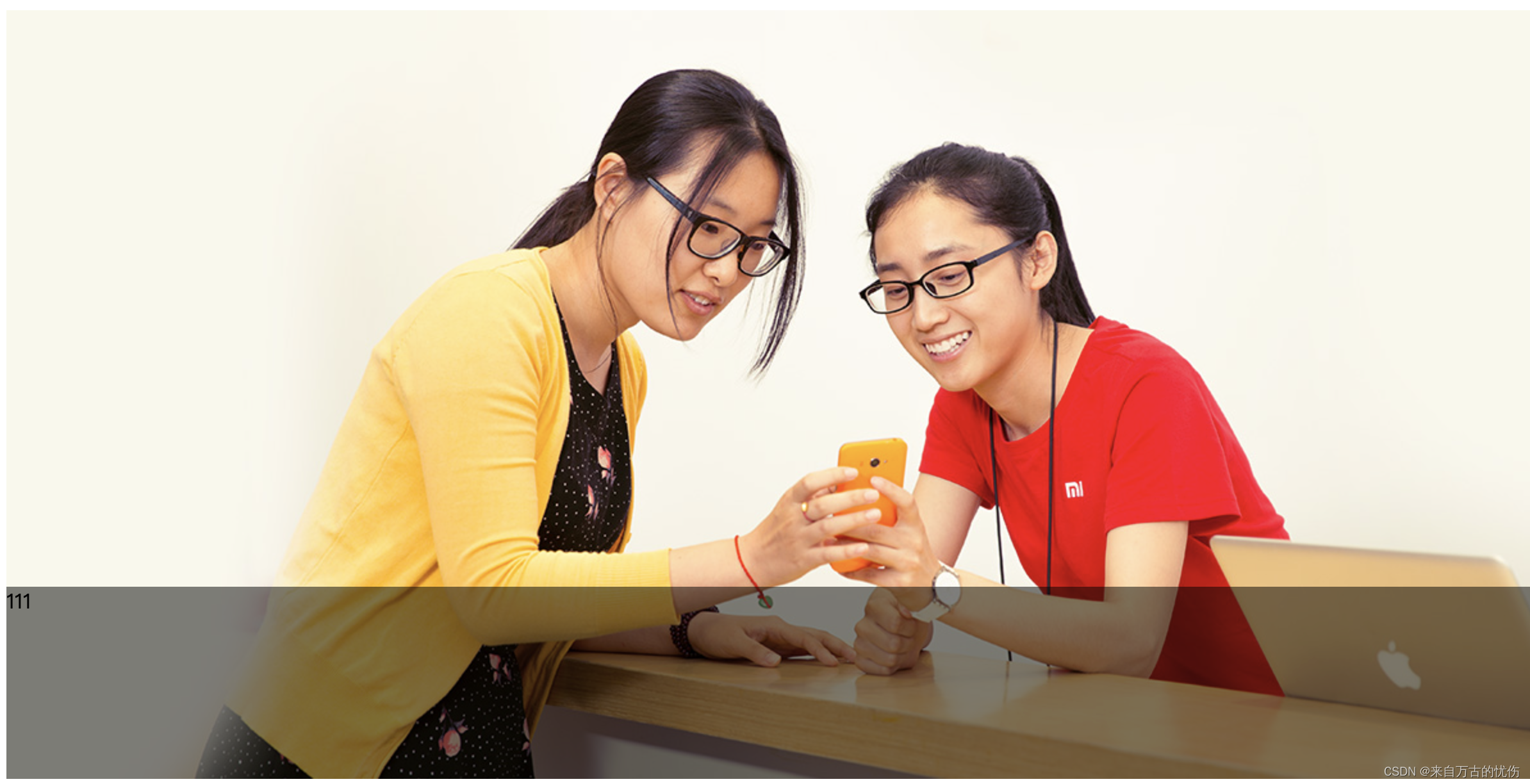
二 banner定位
<!DOCTYPE html>
<html lang="en">
<head>
    <meta charset="UTF-8">
    <meta http-equiv="X-UA-Compatible" content="IE=edge">
    <meta name="viewport" content="width=device-width, initial-scale=1.0">
    <title>Document</title>
    <style>
        .banner {
            position: relative;
            margin: 0 auto;
            width: 1226px;
            height: 600px;
        }

        .mask {
            position: absolute;
            left: 0;
            bottom: 0;
            /* 绝对定位的盒子显示模式具备行内块特点: 加宽度高度生效, 如果没有宽度也没有内容, 盒子的宽度尺寸就是0 */
            /* width: 1226px; */
            /* 如果子级和父级的宽度相同  */
            width: 100%;
            height: 150px;
            background-color: rgba(0,0,0, .5);
        }
    </style>
</head>
<body>
    <div class="banner">
        <img src="./images/bg.jpg" alt="">
        <!-- 遮罩 -->
        <div class="mask">111</div>
    </div>
</body>
</html>
三 焦点布局
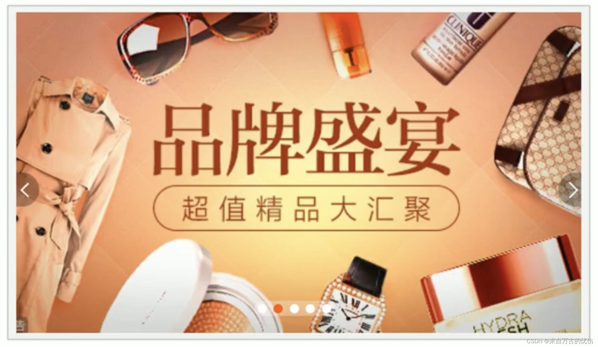
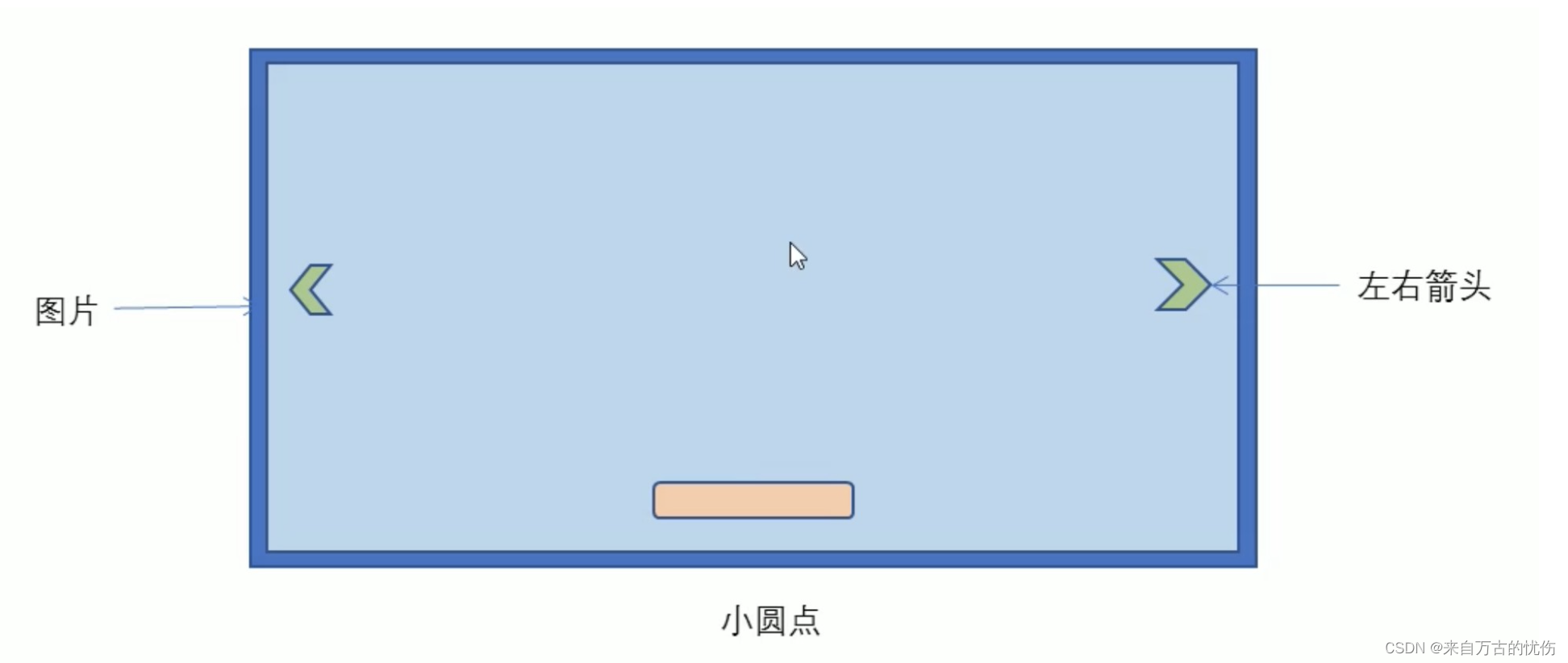
制作:
- 大盒子我们类名为: tb-promo 淘宝广告
- 里面先放一张图片
- 左右两个按钮用链接就好了,左箭头 prev 右箭头 next
- 底侧小圆点 ul 继续做,类名为 promo-nav
<!doctype html>
<html lang="en">
<head>
<meta charset="UTF-8">
<meta name="viewport" content="width=device-width, initial-scale=1.0">
<meta http-equiv="X-UA-Compatible" content="ie=edge">
<title>淘宝轮播图做法</title>
<style>
* {
margin: 0;
padding: 0;
}
li {
list-style: none;
}
.tb-promo {
position: relative;
width: 520px;
height: 280px;
background-color: pink;
margin: 100px auto;
}
.tb-promo img {
width: 520px;
height: 280px;
}
/* 并集选择器可以集体声明相同的样式 */
.prev,
.next {
position: absolute;
/* 绝对定位的盒子垂直居中 */
top: 50%;
margin-top: -15px;
/* 加了绝对定位的盒子可以直接设置高度和宽度 */
width: 20px;
height: 30px;
background: rgba(0, 0, 0, .3);
text-align: center;
line-height: 30px;
color: #fff;
text-decoration: none;
}
.prev {
left: 0;
/* border-radius: 15px; */
border-top-right-radius: 15px;
border-bottom-right-radius: 15px;
}
.next {
/* 如果一个盒子既有 left 属性也有 right 属性,则默认会执行 left 属性
同理 top bottom 会执行 top */
right: 0;
/* border-radius: 15px; */
border-top-left-radius: 15px;
border-bottom-left-radius: 15px;
}
.promo-nav {
position: absolute;
bottom: 15px;
left: 50%;
margin-left: -35px;
width: 70px;
height: 13px;
/* background-color: pink; */
background: rgba(255, 255, 255, .3);
border-radius: 7px;
}
.promo-nav li {
float: left;
width: 8px;
height: 8px;
background-color: #fff;
border-radius: 50%;
margin: 3px;
}
/* 不要忘记选择器权重的问题 */
.promo-nav .selected {
background-color: #ff5000;
}
</style>
</head>
<body>
<div class="tb-promo">
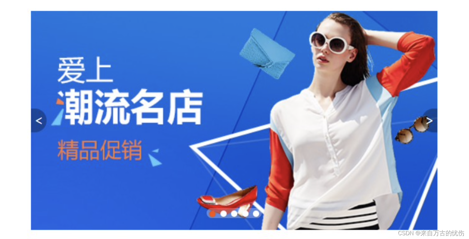
<img src="images/tb.jpg" alt="">
<!-- 左侧按钮箭头 -->
<a href="#" class="prev"> < </a>
<!-- 右侧按钮箭头 -->
<a href="#" class="next"> > </a>
<!-- 小圆点 -->
<ul class="promo-nav">
<li class="selected"></li>
<li></li>
<li></li>
<li></li>
<li></li>
</ul>
</div>
</body>
</html>
四 综合案例
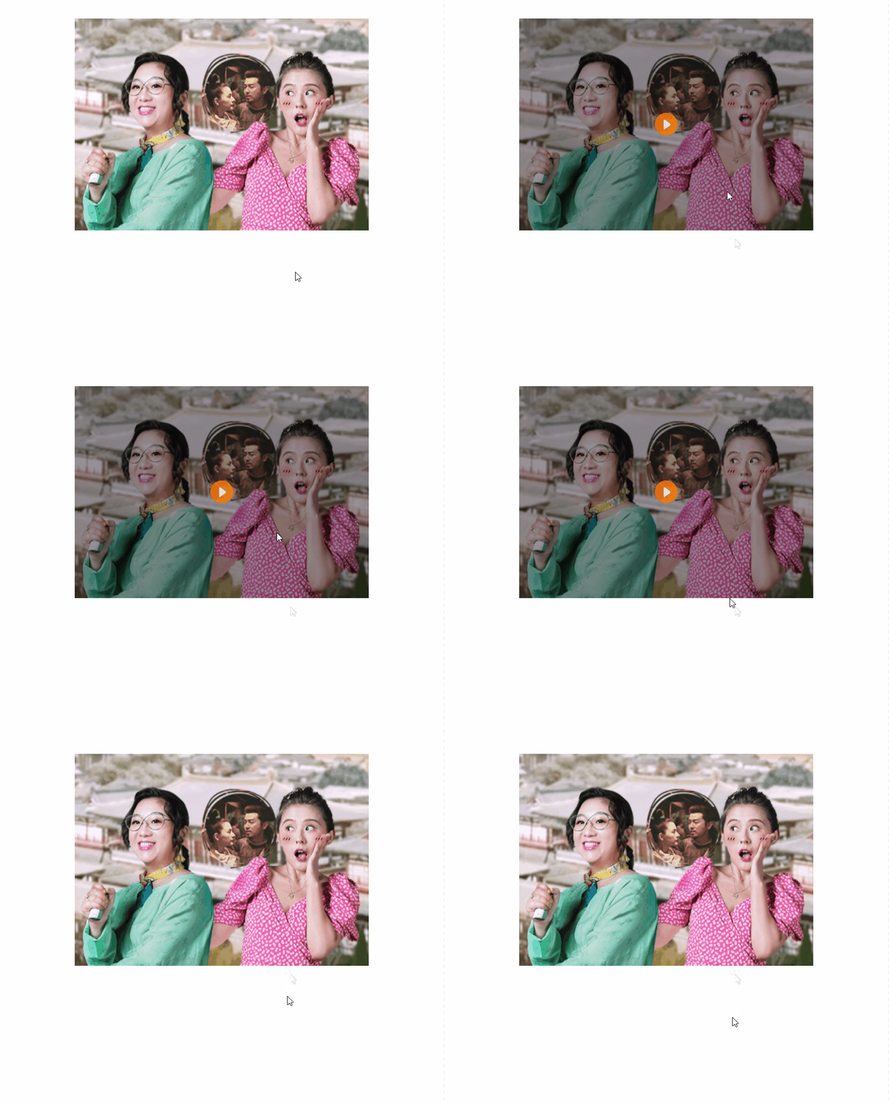
【案例:土豆网鼠标经过显示遮罩】
- 练习元素的显示与隐藏
- 练习元素的定位
核心原理:原先半透明的黑色遮罩看不见, 鼠标经过大盒子,就显示出来。
遮罩的盒子不占有位置,就需要用绝对定位 和 display 配合使用。
<!doctype html>
<html lang="en">

<head>
    <meta charset="UTF-8">
    <meta name="viewport" content="width=device-width, initial-scale=1.0">
    <meta http-equiv="X-UA-Compatible" content="ie=edge">
    <title>仿土豆网显示隐藏遮罩案例</title>
    <style>
        .tudou {
            position: relative;
            width: 444px;
            height: 320px;
            background-color: pink;
            margin: 30px auto;
        }

        .tudou img {
            width: 100%;
            height: 100%;
        }

        .mask {
            /* 隐藏遮罩层 */
            display: none;
            /* 添加定位使其能够浮与其他盒子上方 */
            position: absolute;
            top: 0;
            left: 0;
            width: 100%;
            height: 100%;
            background: rgba(0, 0, 0, .4) url(images/arr.png) no-repeat center;
        }

        /* 当我们鼠标经过了 土豆这个盒子,就让里面遮罩层显示出来 */
        .tudou:hover .mask {
            /* 而是显示元素 */
            display: block;
        }
    </style>
</head>

<body>
    <div class="tudou">
        <div class="mask"></div>
        <img src="images/tudou.jpg" alt="">
    </div>
</body>

</html>

北京人形旗下天工造物具身智能开源社区,聚焦具身天工与慧思开物两大平台
更多推荐
 1
1 0
0- 0


 已为社区贡献4条内容

所有评论(0)